Responsive design is a web design approach that ensures a website looks and functions well across all devices and screen sizes. It adapts layout, images, and content to fit smartphones, tablets, and desktops, providing an optimal viewing experience for users regardless of their device.
Let’s dive into responsive design, a must-have in today’s web development world. Responsive design is a web design approach that ensures your website looks and works smoothly across various devices and screen sizes. Whether someone is browsing on a smartphone, tablet, laptop, or even a smart TV, responsive design adapts the layout and content to fit their screen perfectly.
Fun fact: A responsive design isn’t just about making things look good; it’s about making them function well, too. With so many people accessing websites from mobile devices, having a responsive design can boost user engagement and improve overall site performance.
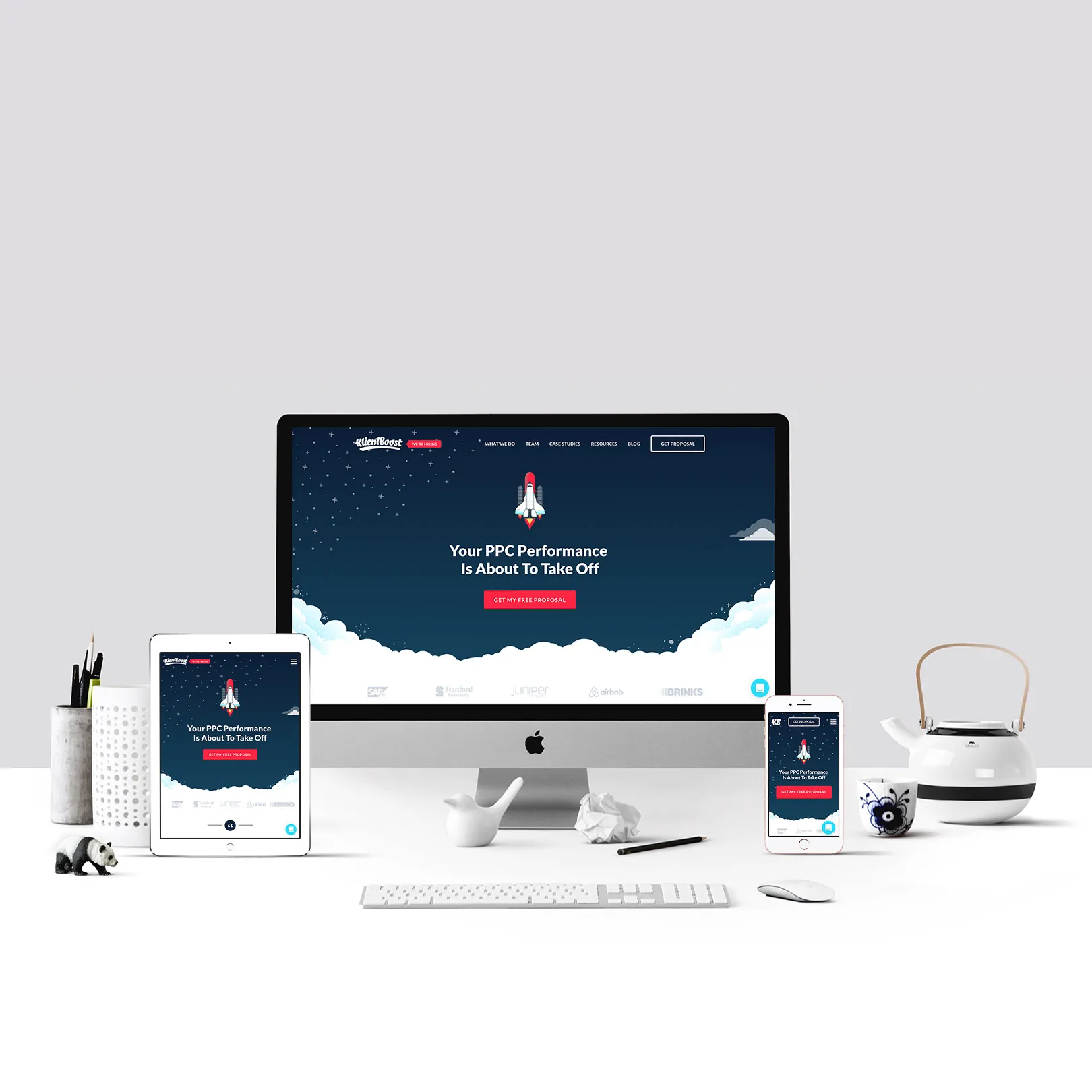
Let’s check out an example of responsive design across different devices.
Responsive design involves a mix of flexible layouts, images, and cascading style sheets (CSS). This means your site adjusts itself based on the screen size and orientation. Imagine visiting a website on your phone and finding that everything is easy to read and interact with—buttons are the right size, text is legible, and navigation is a breeze. That’s the magic of responsive design!
Did you know that around 60.67% of web traffic comes from mobile devices? This highlights the importance of having a mobile-first approach in your design. It means designing for mobile screens first and then expanding the design for larger screens, ensuring a seamless experience everywhere.
Let’s look at the benefits of responsive design:
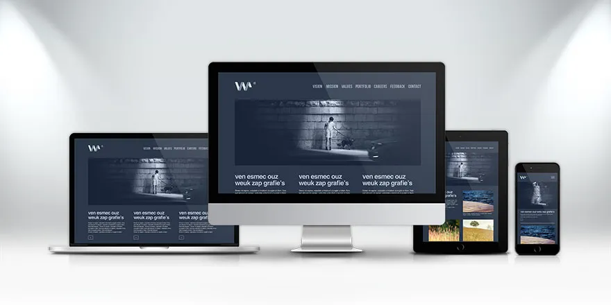
Let’s check out another example of responsive design in action.
Let’s see why responsive design matters for social media:
Imagine a customer loving your content so much that they want to share it on social media. If your website isn’t optimized for social sharing, you might miss out on potential engagement. Responsive design ensures that your content looks great and functions well when shared on social platforms, increasing your visibility and chances of user interaction.
To make the most of social media, integrate social media links on your site, so users can easily share content. Testing and optimizing your responsive design will also ensure a smooth experience, encouraging more shares and interactions.
Ready to take your website to the next level? Embrace responsive design and make sure your site shines on any device. This not only enhances user experience but also boosts your site’s performance and visibility across the web.
Start your journey towards a better, more engaging website today—your users will thank you!
To create an effective responsive website, start with a mobile-first design approach, ensuring the site looks great and functions well on smaller screens before scaling up. Use flexible grids and layouts, responsive images, and media queries to adapt content. Test across various devices and screen sizes to ensure seamless user experience and adjust as needed for optimal performance.
Yes, responsive design significantly impacts social media metrics. A well-designed, mobile-friendly website enhances user experience, leading to higher engagement and more shares. As users are more likely to interact with and share content from a site that works seamlessly on their devices, it can boost visibility and drive more traffic from social media platforms.
To test your website's responsiveness, use tools like Google’s Mobile-Friendly Test and BrowserStack to check how your site performs on various devices and screen sizes. Manually test on different devices and browsers to ensure layouts, images, and interactions are optimized. Regularly update and adjust based on feedback and test results.
To optimize images for a responsive website, use responsive image techniques like "srcset" to deliver different image sizes for various devices. Compress images to reduce file size without losing quality, and use modern formats like WebP for better performance. This ensures fast loading and a seamless user experience across devices.
.svg)

.webp)