Data visualization is the process of representing data through visual elements like charts, graphs, and maps. It helps make complex information more accessible, enabling easier identification of trends, patterns, and relationships. By turning data into visuals, it improves understanding and communication, especially in decision-making and analysis.
Let's explore the world of data visualization! At its core, data visualization is the art of representing data through visuals like graphs, charts, maps, and more. These visuals make it easier for us to interpret complex data, helping us spot patterns, trends, and relationships that raw numbers might hide. Think of it as translating data into a visual language we can all understand.
Fun fact: Data visualization isn't a new concept! It dates back centuries when explorers used maps to present information. However, the real boom in data visualization came in the latter half of the 20th century. With the rise of computers, statisticians had more powerful tools to store, analyze, and present data faster and more effectively. Over the past 30 years, data visualization has grown immensely, and today, we have a variety of tools to create stunning, insightful visuals.
Did you know that people are more likely to engage with content that has visuals? In the fast-paced world of social media, visual data representation is key. Whether it's a graph showing your social media performance or an infographic breaking down trends, visuals grab attention. Ultimately, this helps improve ROI, engagement and brand awareness.
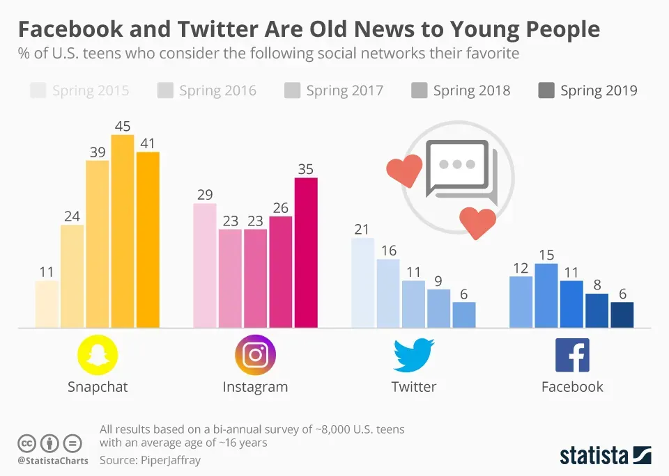
Let’s explore a data visualization from Statista that illustrates the demographics of social media platforms in the US!
Here are some tips for using social media data visualization effectively:
Let’s dive into the Types of Data Visualization:
Did you know that effective data visualization can dramatically improve communication? When done right, it brings clarity to complex data, allowing marketers and businesses to make informed decisions quickly. Plus, it makes data storytelling so much more engaging! So the next time you're looking at a data report, consider how a simple chart or infographic can make all the difference.
The main goals of data visualization are to simplify complex data, highlight key insights, and facilitate better decision-making. By transforming raw data into visual formats like charts, graphs, and maps, data visualization makes it easier to identify trends, patterns, and relationships that might be obscured in raw data. It aims to enhance understanding, improve communication, and enable quick, informed decisions by presenting data in a clear, accessible, and engaging manner. Ultimately, effective data visualization helps users grasp essential information swiftly and accurately, supporting strategic planning and problem-solving.
Choosing the right type of data visualization involves understanding the nature of your data and your communication goals. Start by identifying whether your data is categorical, numerical, or geographical. Then, consider the purpose of your visualization—whether you need to show trends, comparisons, or relationships. Ensure the chosen format aligns with your audience's level of expertise; simpler visuals work best for general audiences, while more complex ones can be used for specialized viewers. Aim for clarity and simplicity to avoid overwhelming the viewer, and select interactive options if your goal is to provide in-depth exploration of the data.
For effective social media data visualization, several tools stand out. Google Data Studio is highly versatile, offering customizable reports and dashboards with various data connectors, making it ideal for integrating and visualizing social media metrics. Tableau provides powerful, interactive dashboards that help in analyzing and presenting complex data in an accessible way. Power BI by Microsoft also offers comprehensive visualization options, enabling users to create detailed reports and gain insights from social media data.
The process of data visualization involves several key steps. First, define the objective by understanding the purpose of the visualization and the insights you wish to convey. Next, collect and prepare the data by gathering relevant information and cleaning it to ensure accuracy. Then, choose the appropriate visualization type based on the data and the message you want to communicate, such as charts for comparisons or graphs for trends. Create the visualization using tools like Tableau or Google Data Studio, ensuring clarity and simplicity in the design. Finally, interpret and present the visualizations to your audience, focusing on key insights and ensuring the data effectively supports your conclusions. This structured approach helps turn complex data into actionable insights.
.svg)
